At Vimora, we’ve seen this one thing over and over again: you can design the most beautiful screen, but if the words on it confuse people, the whole experience breaks.
Take a simple appointment booking flow in a healthcare app. The design might guide users with clean buttons and intuitive steps—but it’s the words that tell them why they’re here, what to do next, and what happens after they click. We’ve worked with healthcare clients where a small change in microcopy—like switching "Submit" to “Book My Visit”—led to a huge drop in user hesitation. That’s not just better design. That’s clarity. That’s trust.
This response is important for our ability to from mistakes but it alsogives rise to self-criticism.
In retail, we once designed a sleek checkout flow for an e-commerce brand. But what made it actually work was rewriting a single message that popped up when a product was out of stock. Instead of “Item unavailable,” we said, “Oops! Just missed it. Want us to let you know when it’s back?” That sentence turned frustration into a friendly offer—and doubled the opt-ins for notifications.
Work Harder & Gain Succsess
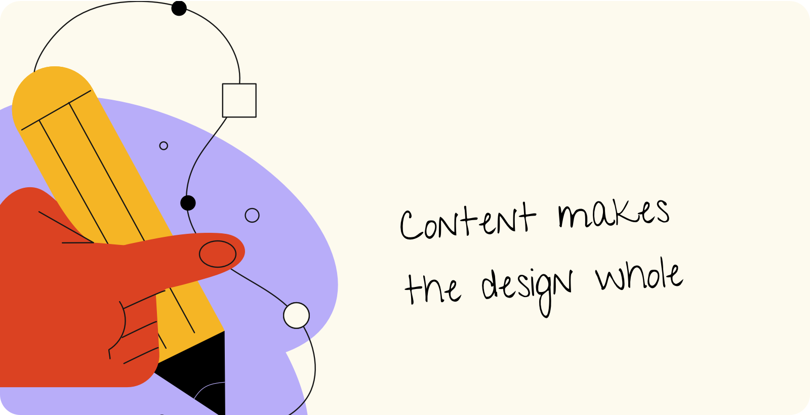
This is what happens when UX and content work hand in hand. Good design gives structure, but it’s language that fills it with meaning. Together, they make the experience feel thoughtful, human, and whole.